Dashboard
Create your own dashboard
If you log in to your TrackOnline account, the first thing you will see is a dashboard. This dashboard allows you to see at a glance what is happening in your administration. For example, how many device messages have been received during the last week, what are the balances of your items at each of your locations and where are your unique items located at the moment.
This not only saves you time, but also gives you the option to act on time if needed!
How you create your dashboard(s) and how you can arrange them in the best possible way will be explained in the next paragraphs.
Create your first dashboard
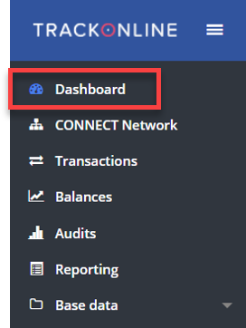
To visit the dashboard page, you can click on 'Dashboard' at the left side of the screen. See the image below.
Dashboard menu
You will now enter the dashboard page. If you visit this page for the first time, you see a blank window as shown in the image below.
Dashboard empty overview
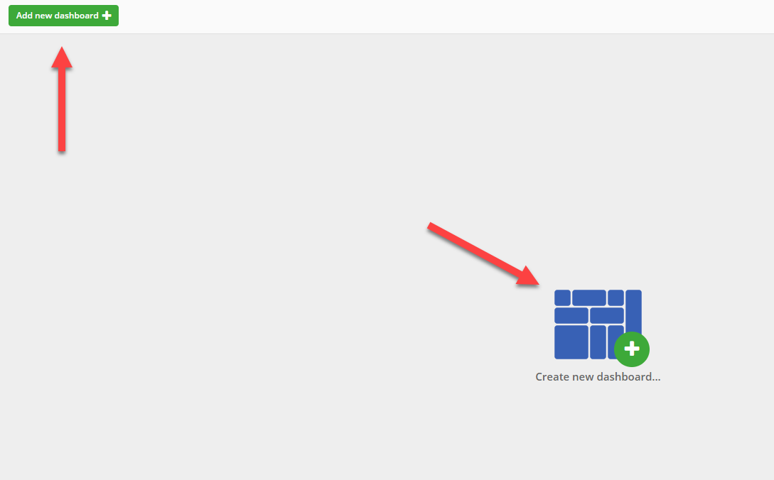
To add a new dashboard click on the  button, or on the image in the middle of the page. See the red arrows in the image above.
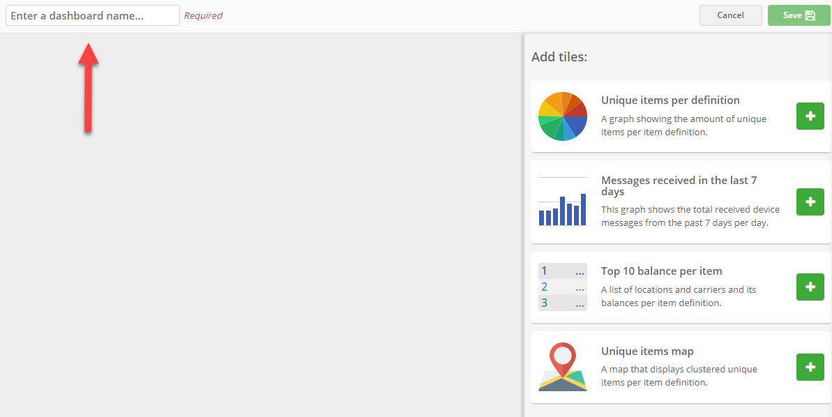
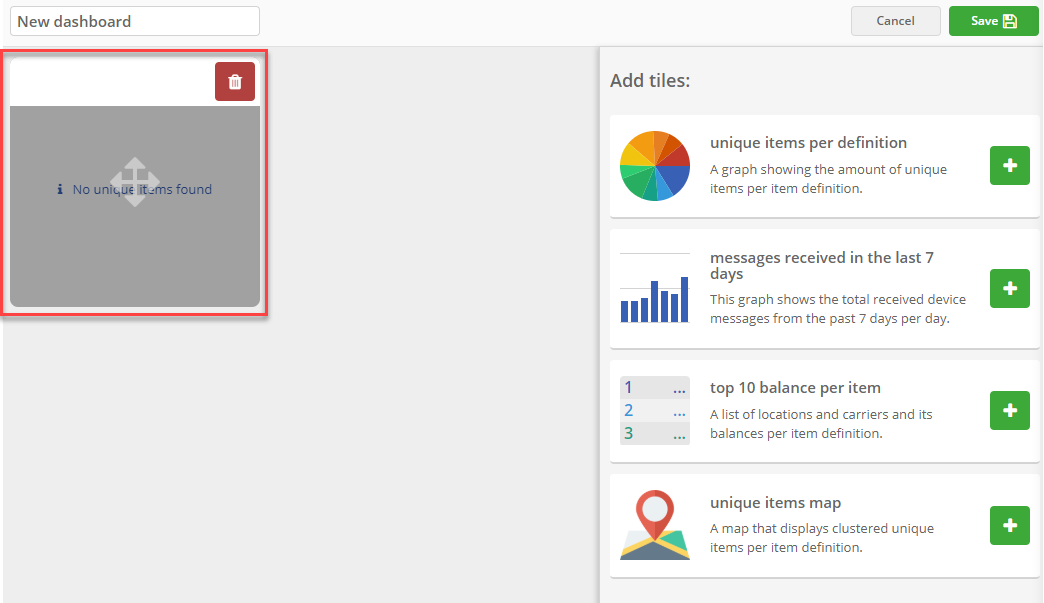
You see a screen as shown below. On the top, indicated with the red arrow, you can type in a name for your dashboard. On the right side of the screen you see the different tiles that you can add to your dashboard. An explanation about each of these tiles is given in the paragraph Dashboard tiles.
New dashboard
In this example we choose to name our dashboard 'New dashboard'. Now automatically the  button on the top right of the screen, becomes active.
Add tiles
You can now fill your dashboard with tiles. Therefor click on the  button of the tiles you would like to add. The tile is now added to your dashboard, see the image below.
New tile
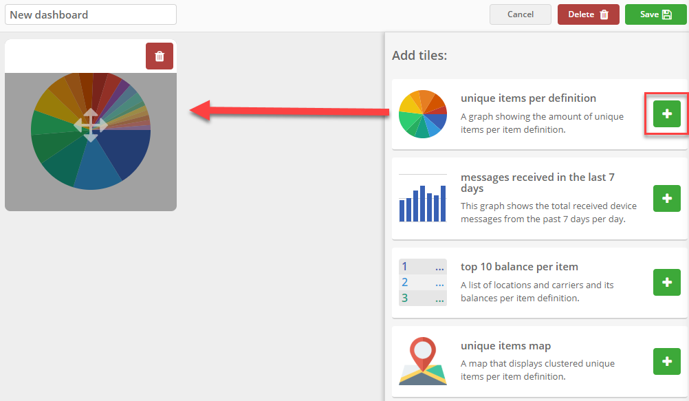
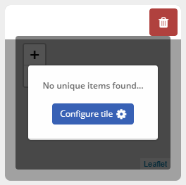
In the example above we have chosen to add the 'Unique items per definition' tile. If you don't have unique items in your administration, the tile will look something like the image below.
New tile without data
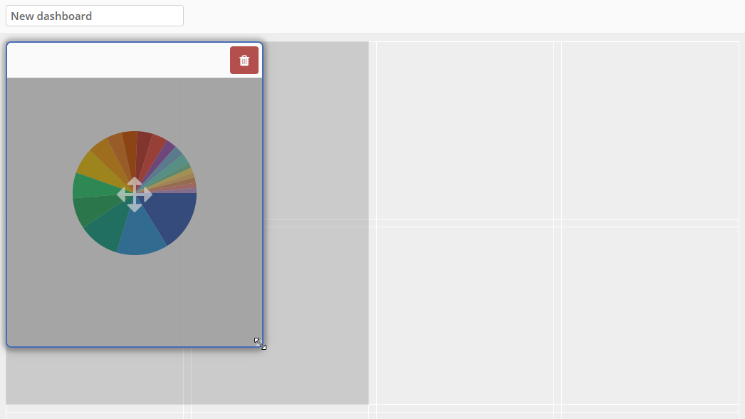
Resize tiles
If you would like to resize the tile, you can click on one of the corners of the tile and drag it into any size you like. See the image below.
Resize dashboard tile
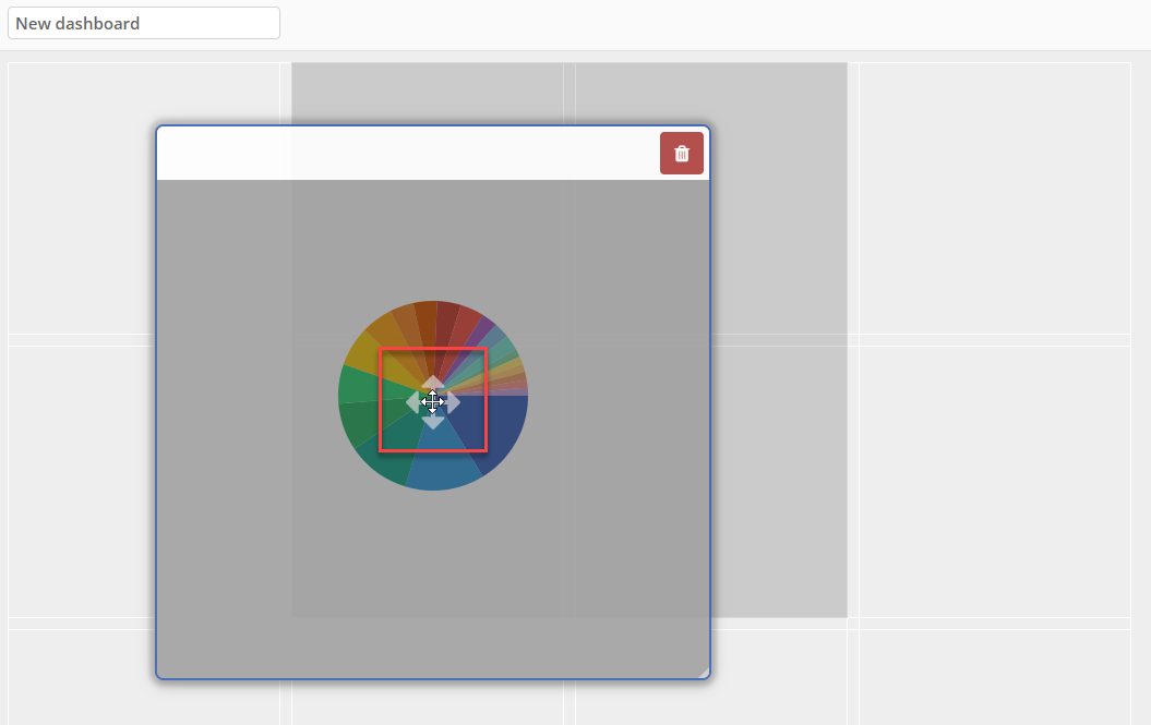
Move tiles
If you would like to move the tile to another position on the dashboard, you can click and hold your mouse on the cross in the middle of the image (see the red frame in the image below). You can now drag the tile to the right position.
Move dashboard tile
Configure tiles
For some tiles, you can configure the tile. This will look like the image below.
Configure dashboard tile
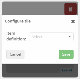
To configure the tile, click on the  button.
The following window appears. Here you can choose the item definition you would like to see the data of on your dashboard. If you have chosen one of the items, you can click on the save button.
Configure dashboard tile window
Note:
You can also change the configuration later after you have saved your dashboard.
Save dashboard
You can drag as many tiles on your dashboard as you like. It is also possible to drag the same tile more than once on the dashboard. For example, when you would like to see the top 10 balances of two different items.
If you have configured all your tiles and put them in the right size and position, you can save your dashboard. Therefor click on the button.
An example of how your dashboard could look like, is shown in the image below.
Example dashboard
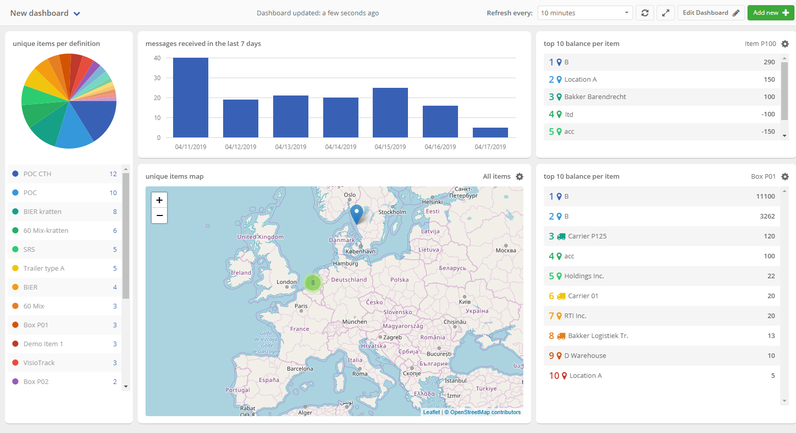
Dashboard configuration
In the image above you see an example of a dashboard. This image shows a bar on the top of the screen where you can configure your dashboard settings. For instance, you can set the time that the dashboard has to refresh, or make your dashboard full screen. Below you can find more information about each of the options.
Dashboard configuration options

- Here you can switch between your dashboards if you have more than one. In the dropdown menu that is shown, you also have the option to add a new dashboard.
- Here you can see how long ago the dashboard has been updated.
- Here you can set the interval time that the dashboard has to refresh.
- Here you can manually refresh your dashboard. For instance, when you just have made some changes in your administration and you would like to see it in your dashboard. With this button you don't have to wait until the dashboard refreshes automatically, but you can do it immediately.
- Here you can make your dashboard full screen. To get an even better look at your data.
- If you would like to edit your dashboard, you can click on this button. You now enter a window similar to the image 'New tile' in the paragraph Add tiles.
Delete dashboard
If you would like to delete a dashboard, first click on the  button. Now the
  button is available on the top right of the screen.
Click on the delete button. You see a message as shown in the image below.
Remove dashboard message
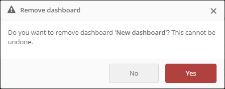
Click 'Yes' if you want to delete the dashboard. If you have changed your mind, click 'No'. You will then return back to the edit dashboard page.
Dashboard tiles
You can add multiple tiles to your dashboard. You can find all the tiles on the right side of the page when you are creating or editing your dashboard.
In this paragraph we explain what each tile shows and what kind of data it represents. Scroll down to take a look at the different possibilities.
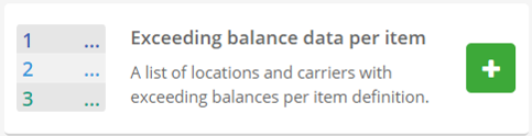
Exceeding balance data per item PROPRO+Enterprise
A list of the locations exceeding their maximum balance for an item over the last rolling period.
Exceeding balance
When you have added the tile to your dashboard, it looks similar to the image below.
Tile: exceeding balance
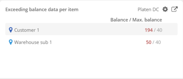
The duration and the item can be configured in the widget settings. If you activate the Use maximum balance switch, the widget will use the maximum balance set in the location profile of each location. You can learn more about the location profiles by clicking HERE.
If Use maximum balance is not activated, the widget will just show the balance of the different locations over the last rolling period.
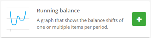
Running balance
A chart of the items balance with a location.
Running balance
When you have added the tile to your dashboard, it looks similar to the image below.
Tile: running balance
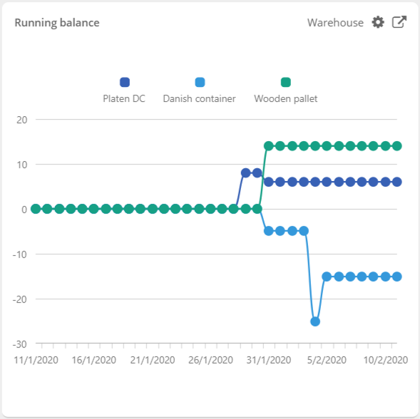
The period can be configured in the widget settings, as well as the location. You can also add or delete the items you want to see on the chart or not and view the balance resulting of processed transaction only by activating the switch.
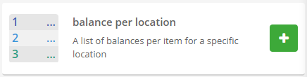
Balance per location
A list of balances per item for a specific location.
Balance per location
When you have added the tile to your dashboard, it looks similar to the image below.
Tile: Balance per location
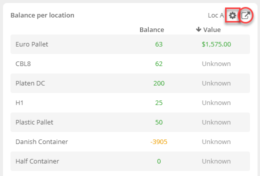
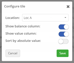
The image shows all items of the selected location or carrier. In this example we have selected location 'Loc A'. If you would like to change the location, click on the gearwheel (marked with the red frame). A new pop-up window opens. See the image below.
Here you can select another location. You can also choose if you would like to show the balance and value column in the tile and if you want to sort by absolute values. Click on 'Save' if you want to save the changes.
In the tile you can also click on the square with the small arrow, marked with the red circle in the image above. This brings you to the 'Balance overview'.
Change location in tile
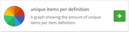
Unique items per definition
A graph showing the amount of unique items per item definition.
Unique items per definition
When you have added the tile to your dashboard, it looks similar to the image below.
Tile: Unique items per definition
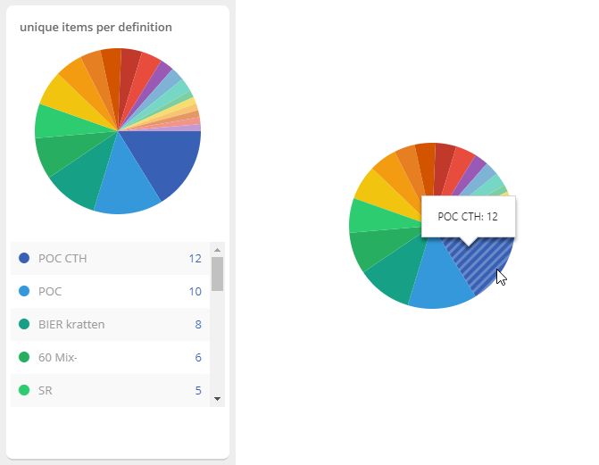
In this image you see the distribution of unique items per item definition in your administration. If you hover the diagram with your mouse, you see which color represents which item definition. Also the amount of the unique items are visible (see the diagram on the right).
Under the diagram you see the same information but as table. In this table you also have the possibility to click on one of the item names. This brings you to the detail screen of this item.
Note:
This tile is only showing data when there are unique items in your administration.
ℹ️ More information about unique items can be found HERE.
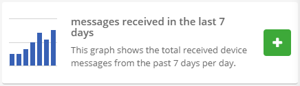
Messages received in the last 7 days
A graph showing the total received device messages from the past 7 days, per day.
Messages received in the last 7 days
When you have added the tile to your dashboard, it looks similar to the image below.
Tile: Messages received in the last 7 days
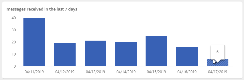
In this image you see the number of messages each day, for the last week. These are the messages that the unique items received. If you hover the chart with your mouse, you see the exact number of messages.
Note:
This tile is only showing data when there are unique items in your administration.
ℹ️ More information about unique items can be found HERE.
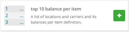
Top 10 balance per item
A list of locations and carriers balances for a specific item definition.
Top 10 balance per item
When you have added the tile to your dashboard, it looks similar to the image below.
Tile: Top 10 balance per item
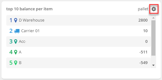
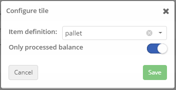
In this image you see the amounts of the selected item per location (or carrier). In this case we have selected the item 'pallet'. To change the item of which you want to see the top 10, click on the gearwheel at the top right of the tile (marked with the red frame in the image above). A new window appears, see the image below. Here you can switch the item. It is also possible from this window to configure if you want to show only processed balances or not. Finally click on the 'save' button to save the new settings. A new top 10 is shown.
Change item definition of dashboard tile
If you click on one of the location/carrier names, you go to the balance page of this specific location/carrier.
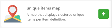
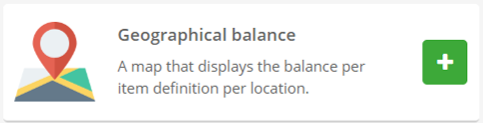
Unique items map
A map that displays clustered unique items per item definition.
Unique items map
When you have added the tile to your dashboard, it looks similar to the image below.
Tile: Unique items map
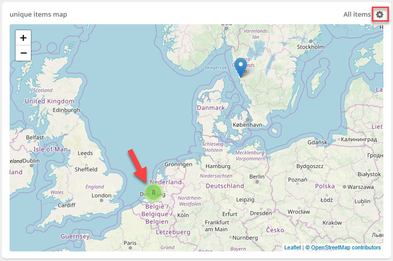
In this image you see a map with the positions of the unique items of your administration. If you want to see the location of unique items of a specific item definition, you can click on the gearwheel on the top right of the tile (see the red frame in the image above). This image shows now that all items are selected. If you click on the gearwheel you can select a specific item. When you have chosen one of the items, click on the 'save' button. Now the map only shows the positions of the unique items of the selected item definition.
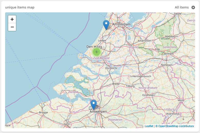
In the image above you can also see a green circle with the number 8. This means that there are 8 unique items located in that radius. If you click on this circle the map zooms in, as shown in the image below. Now you can distinguish more positions. You can do this more times so you can eventually distinguish all the items.
Unique items map zoomed in
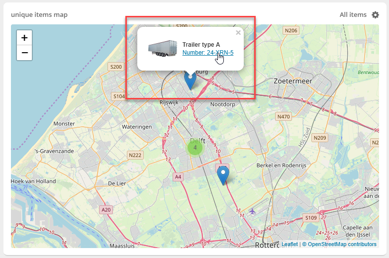
If you click on a specific position, as shown in the image below, you can see which unique item is located in that position. By clicking on the item, you go to the detail window of this item definition.
Find item on the unique items map
Note:
This tile is only showing data when there are unique items in your administration.
ℹ️ More information about unique items can be found HERE.
Geographical balance
A map of the balances for an item per location.
Geographical balance
When you have added the tile to your dashboard, it looks similar to the image below.
Tile: geographical balance
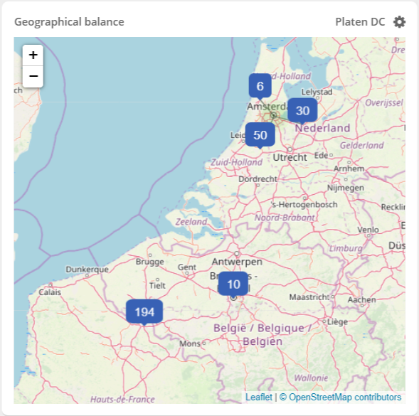
You can configure in the widget settings the item you want to see the balance of and the locations you want to see on the map. Additionally, you can also select tags to filter the locations and view the balance resulting of processed transaction only by activating the switch.